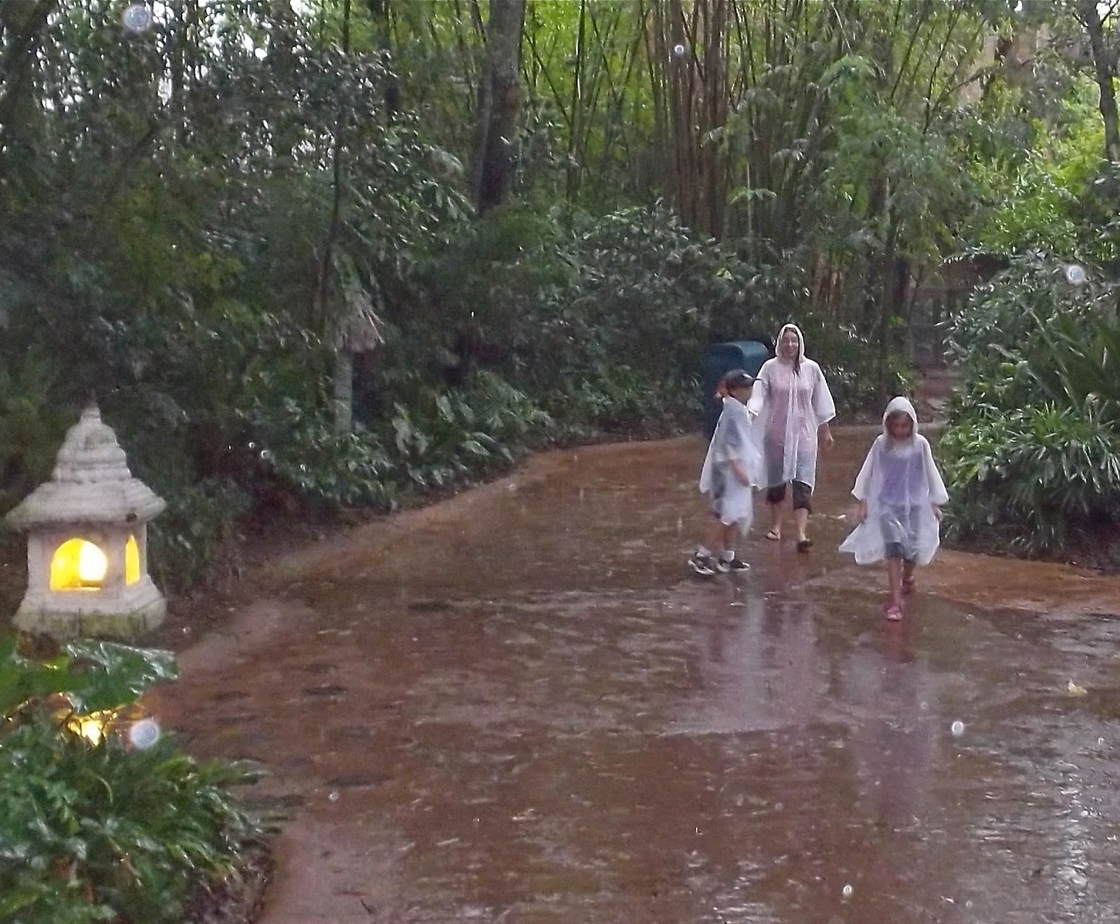
Animal Kingdom's organic pathways
It's not that Animal Kingdom is a bad park. It's actually got a lot going for it -- intricate detail, some good rides, and some excellent shows. I'd still rather go to Animal Kingdom than Six Flags (although I like Six Flags, too). So I need to emphasize -- Animal Kingdom is a fine park. It's just not... well... at the same level as the other Disney parks. It's missing something.
Now if you're the average theme park goer, I imagine you might respond, "Duh, Chris! Of course it's missing something: rides and restaurants!" Animal Kingdom has a reputation as being barely more than a half-day park, and its list of attractions can seem fairly sparse compared to the Magic Kingdom. I don't know that I agree with that particularly - if you consider the animal trails and exhibits to be attractions, which I do, there's plenty to fill a day with.
Even if it was only a half-day park, there's no reason it couldn't be an excellent half-day park. But it's still lacking that missing ingredient. And what is that ingredient?
France pavilion at Epcot
Well, as fun as the various attractions are and as much I love eating at the parks, the thing that really appeals to me about Disney are those moments of just being enveloped in beautiful design. It hits me frequently when I'm walking around World Showcase at Epcot as the sun goes down and the lights come up. It hits me walking past the dim lights at night in Frontierland, or looking down Sunset Boulevard at the Tower of Terror, or looking up at the Chinese Theater, or entering the Mexico pavilion, or coming out of Space Mountain into Tomorrowland at night, or sitting in Gaston's Tavern and listening to the music, or hearing the train whistle or Haunted Mansion wolf-howl anywhere in Magic Kingdom. I love those moments. I don't know that I've ever had a single one in Animal Kingdom. I've had enjoyable times. But I haven't had that beautiful moment of appreciation.
I realize that this is hugely subjective, so there are probably some folks who do feel those moments in Animal Kingdom (can't imagine why, though), but I have talked to a number of people who seemed to agree with me - there's just something kind of "blah" about Animal Kingdom that's hard to put into words. The thing that's weird is that Animal Kingdom, by any formula, ought to be the best park of them all. Unlike, say, California Adventure when it opened, Animal Kingdom does not feel cheap or tacky (well, except for that one area... COUGH). It has an amazing level of authentic details, layer upon layer of realistic touches. It has a unified vision - the brainchild essentially of one very talented guy, Imagineer Joe Rohde. In a sense, the park does everything "right." And yet...
After reading and listening to a lot of interviews with the creators of Animal Kingdom (as well as other Disney parks), I've got a theory as to why Animal Kingdom is so weak. It's not really the lack of rides, the focus on animals, or the relative lack of table service restaurants. Animal Kingdom fails to deliver those magic moments because it's not really trying. It has the wrong goals.
This can happen in any artistic endeavor. If you're an artist of any kind, it pays to ask yourself - what's driving you to make it? The successful artists frequently seem to have a relentless focus on the emotional experience of the audience - making a connection. How is the audience going to feel when this or that happens in my musical, or they get to this or that chapter of my novel? It's no guarantee of success, obviously, but making a connection with the audience is profoundly challenging. It therefore helps out a lot if you're actually trying to achieve the goal. With a surprising frequency, however, I hear artists explain their motivations for producing their art and it's something ancillary to its emotional impact.
I've read creative people enthuse over solving tricky problems, creating a world, imparting a particular "message" through their art, addressing some particular social ill, or even simply "being" a writer or an artist or whatever. None of these things are bad in and of themselves, but if they're the only driver, the odds are fairly high the project is going to fail at connecting with the audience - because none of these things directly do. "I want to make something scary" has a FAR higher chance of success than "I want to subvert the traditional quest narrative" (even if it really needs subverting).
Listening to Joe Rohde and other Imagineers talk about Animal Kingdom, it becomes fairly clear that connecting emotionally with the audience is not, and never was, a high priority. They like to gush about how organic the park is, how if a tree falls over they just leave it, how the paths twist naturally through the landscape. They talk about how authentic the exquisite detailing is in the queue for Expedition Everest - how accurately it recreates real structures in Nepal. They talk about the importance of nature, how nature is the ultimate good, in quasi-religious tones.
They do NOT, however, talk about how they want their audience to feel inspired, relaxed, reassured, thrilled, scared, happy, sad, enraged, or anything. And consequently, few people feel those things at Disney's Animal Kingdom. You can tell in the design, the moment you walk in the park.
The entrances to Disneyland (and the Magic Kingdom) are famously designed like a movie - building anticipation until just the right moment when you round the corner and get the big reveal of the castle at the end of Main Street. Everything is arranged for maximum emotional impact. Now consider the entrance to Animal Kingdom. Called "the Oasis," their equivalent of Main Street is a few winding paths through the woods - no shops, only a few light animal viewing locations. Being named the Oasis, it might sound like it's all about creating a relaxed feeling in guests, but in execution, it's really not. The music is not soothing. There aren't a lot of places to sit. It's the entrance to a theme park, so it's crowded, and it's outdoors in Florida, so it's going to be hot and muggy. The design of winding paths isn't particularly relaxing in and of itself, but it's designed not to be relaxing but to appear undesigned, which is not the same thing. Nature, of course, is an awesome and beautiful thing, which is why, if one wants to see nature, one goes to, say, a national park, where nature lives. One does not go to a theme park, which is all about appreciating enveloping, immersive design. Animal Kingdom is a theme park trying very hard not to be a theme park. It's a theme park trying to be nothing. It almost succeeds.
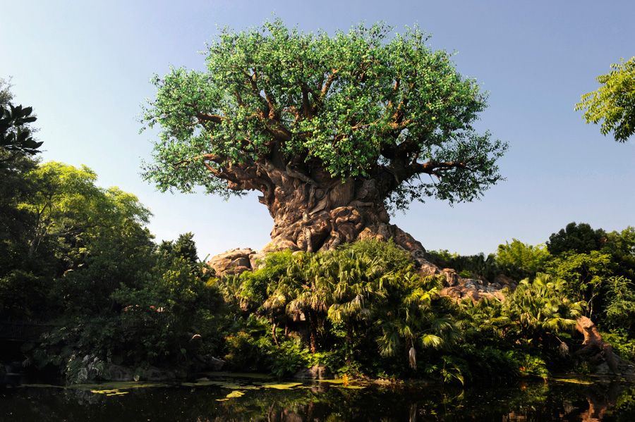
The Tree of Life
Instead of a beautiful, towering castle or a grandiose floating silver golf ball as a central icon, Animal Kingdom gives us a giant tree made of leaves that aren't quite the right color. It's surrounded by a lot of real trees to give it an organic look and feel, meaning after you emerge from the Oasis into the center hub-like area, it takes you a second to realize you're even looking at the park icon. If you know what's going on, you might appreciate the organic design on an intellectual level, but it's not going to make any particular emotional connection with you - and why should it? It's not trying to.
Discovery Island, the central hub area, is confusing and maze-like, with isolated store buildings here and there but no logical layout. This is true throughout the park, but while it does make it easy to get lost, the real crime is that it prevents ordered design from doing its thing. In other parks, pathways are arranged to entice you to walk further in. Walt liked to put tall attractions at the end of pathways, calling them "wienies" (cough) so that people would be attracted to the far reaches of the park. Cinderella Castle, the Tower of Terror, Space Mountain, Big Thunder Mountain Railroad all function as wienies. The circular layout of World Showcase around a lagoon means that virtually every country's pavilion functions as a wienie, too. The lack of straight paths and the attempts to make everything look natural means there aren't a lot of well-designed sight lines, which means there aren't a lot of wienies in Animal Kingdom - only the massive Expedition Everest really qualifies.
Even the attractions themselves fail to make much of an emotional connection. Everest is a nice roller coaster, and Dinosaur is a reasonably fun "dark ride," but they're both terrible at building anticipation. Unlike Tower of Terror, which brilliantly builds suspense from the moment you see it at the end of Sunset Boulevard, Everest sits there like a very tall lump. There are no touches designed to suggest danger. No eerie music. No darkness or lighting effects. No dangerous-looking, crumbling architecture. Nothing threatening at all. What indications there are of the danger of the yeti inside are subtle. You shouldn't have to read a paragraph in a museum exhibit to feel some suspense. Until the moment your train goes through the initial temple on its ascent into the mountain you might as well be in line for the carousel, given the complete lack of emotional engagement you feel (unless you're scared of roller coasters, of course, in which case, you're already at DEFCON 1).
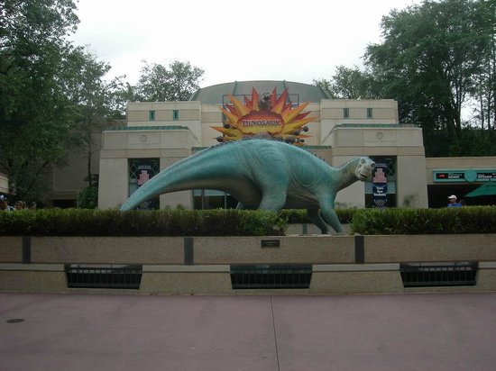
Dinosaur's entrance
The same is true of Dinosaur. The queue area gives you a museum exhibit narrated by Bill Nye the Science Guy. The exterior is a fairly bland looking building. It's supposed to be a thrill ride. Who would know?
Or take the Harambe village area, probably the area with the most layers of detail and most areas to explore. Compare Harambe to your average World Showcase national pavilion. In Epcot, the countries are essentially reduced to picture postcards with restaurants - hardly an authentic representation of a modern nation. Harambe, however, while it represents a fictional part of Africa, is alive with broken bricks and decaying newspapers plastered on old walls. You can tell the instant you step in to Harambe that some Imagineer did a whole lot of research. And it doesn't matter. Not really.
Harambe village
As inauthentic as a picture postcard is, a picture postcard is striking. Maybe it's pretty, maybe it's charming, maybe it's exciting, maybe it's funny, but it's something. It serves an emotional function and hence, requires design. It captures an emotional height and makes an emotional connection. I don't need authentic. I don't need organic reality. I experience organic reality every day! That's not why anyone goes to a theme park. I need something to be authentic enough to not spoil the illusion, and then I need it to deliver something awesome. Something that makes an emotional connection. It could be serenity like the Japan pavilion, mystery and atmosphere like the Mexico pavilion, charm like the Germany pavilion, or even (dare I say it) grand patriotism like the America pavilion. What does Harambe make you feel? It's just kind of there. And yet it's so detailed! So intricately crafted! But to what end? The whole area has no answer to the emotional "why?"!
(World Showcase actually almost fell prey to the same kind of thinking. In the early planning phases, Disney was talking about having each country be represented by an identical, bland modern structure of some kind. The thinking was that all countries would then appear equal. This was rightly discarded as a horrifyingly stupid idea. Sure, you might avoid giving a few extremely sensitive people offense, but you lose the personality, the flavor, the joy of seeing the traditional architecture of each country! Fortunately, in Epcot at least, making an emotional connection won out over ancillary concerns.)
I love the safari ride. I love Finding Nemo: the Musical (I would). I love Flights of Wonder. Animal Kingdom is not a bad park. It's just not as awesome as it could be.
If it tried, though, I bet it really could be...


