Why People SAY Chrono Trigger is Great Isn't Really Why It's Great

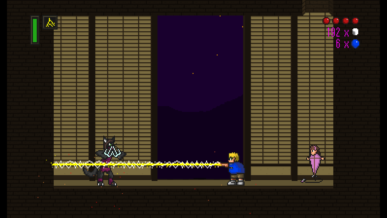
ctshot10.png

I recently played the free demo of a game called Lost Sphear, a game that appears to be deliberately imitating Chrono Trigger, one of my favorite RPGs of all time.  The game... did not interest me very much.  It felt dull, flat, and lifeless.  The mechanics were confusing and complicated.  For all the talk about how this game and the one before it from the same studio (I Am Setsuna) are an attempt to recreate the golden age of SNES RPGs, I was hoping not to be so thoroughly disappointed.  But here we are.

I wonder whether the problem is a radical misdiagnosis of what it is that made Chrono Trigger so great.  Lots of people agree with me that it's a fantastic game (I'm always surprised when lots of people agree with me...), but when you ask them why, I think the answers they frequently give, well, aren't quite right.  

So, for your compare-and-contrast benefit, I am now going to list you for "Why People SAY Chrono Trigger is Great" vs. "Why Chrono Trigger is ACTUALLY Great."

Why People SAY Chrono Trigger is Great:

  • No random encounters
  • No fighting on the world map
  • Position-based combat system without going to separate "battle screen"
  • Intriguing time-travel paradoxes and puzzles
  • Excellent soundtrack by Yasunori Mitsuda

Why Chrono Trigger is ACTUALLY Great:

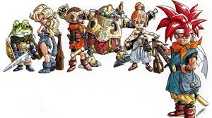
  • Strong, varied, and colorful character and world design choices that make an instant impact
  • Simple, straightforward battle mechanics and low difficulty level
  • Strong, consistent fun, cartoony tone balanced with a serious weighty story with immediately established stakes and underlying depth
  • Time-travel adventure
  • Excellent soundtrack by Yasunori Mitsuda

For the record, it's not that the things in the first list are BAD.  I like those things, too.  It's just that if you were to create a game that has those things and ONLY those things, and compare it to Chrono Trigger in your ad copy, you are likely to come up with a game as dull and lifeless as, say, Lost Sphear.

The "no random encounters" bit is especially tiresome.  It's true that random encounters can be problematic for a lot of RPG players, but plenty of RPGs got rid of them before and after, and very few of them came anywhere close to the awesomeness of Chrono Trigger.  What's interesting about Chrono Trigger's battle system is not that the encounters aren't random, or that they don't take you to a separate "battle screen," but that a large percentage of them are choreographed, designed, and INTERESTING experiences.  Instead of just plopping enemies onto the map to await the hero's coming, a la Final Fantasy XIII, enemies are frequently engaged in activity when you find them - or there's some clever twist to how they hide themselves from you or attack you.  A large percentage of the fights in Chrono Trigger have fun gimmicks to them - so it's more than the fact that the battles aren't random.  A lot of the time, they're actually NEW CONTENT.  They're interesting in and of themselves!

Chrono Trigger characters.jpg

And this goes to the heart of the appeal of Chrono Trigger - a game that almost perfectly follows the Pirates of the Caribbean Principle.  It's constantly making interesting LOUD and STRONG design choices, in virtually every apsect of its creation.  The five time periods are all radically different from one another - different color palettes, different emotional tones, different designs, different musical arrangements.  The six main characters, likewise, are all radically different from each other - different combat styles, different personalities, different shapes and sizes, different colors, different speech patterns.  Part of what allows the "dual tech" battle system to work so beautifully is that the six characters are so varied and colorful, that it creates an awesome feeling of SYNERGY when they come together to join attacks.  Every location, every character is immediately emotionally graspable and relatable.  Story segments and scenes are brief but resonant.  Chrono Trigger's design choices READ.  They make an instant impact.

Couple this with a battle system that's remarkably easy to pick up and play with, an underlying story full of intrigue and twists (as traditional for a JRPG), and one of the greatest soundtracks in video game history, and you've got a recipe for tremendous success.

The sad part of all this is that a lot of the things that made Chrono Trigger awesome were not unique to Chrono Trigger... back then.  Final Fantasy 6 and 7, Super Mario RPG, and Earthbound all followed these principles, just to name a few.  To some extent, the Pirates of the Caribbean Principle was ASSUMED in games of that era.  Too frequently, nowadays, dialog is interminable, characters are bland and indistinguishable from one another, the tone is either over-serious or over-silly, and battle systems are over-complicated.

And yes, I am trying to get at a little of those old-school values in my own game, but I admit it's challenging sometimes.  There's a reason, I think, that these virtues have fallen out of favor - they're hard to achieve!  At least I know the goal, however, which is something.

So please... don't tell me your game is "imitating Chrono Trigger" unless you're imitating its design strength, its straightforward simplicity, its melodic score, its vibrant color and variety, and its fun and adventure.  More of that, please!  

Dear Game Devs: No Report Cards In Games!

I realize this is going to make me sound just a tad crazy, but I've really begun to loathe these things:

Report cards.

In video games.

They seem to have become increasingly popular over the last 5-10 years - and not just in phone games, where you might actually expect poor design choices, but everywhere.  And they've started driving me crazy.

Do you remember playing Super Mario Bros as a child?  If you're anything like me, you probably had a really hard time as the levels started to progress - those blasted Hammer Brothers, those long, bottomless pits, those flying fish.  The first few levels were really easy, but it got difficult.  Nonetheless, the challenge could really pay off - finally reaching that flag pole at the end of the level was a really satisfying event.  It felt like an achievement.  The game even gave you fireworks.

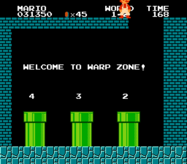
There was another satisfying feeling playing Super Mario Bros - that feeling you got when you found a "secret."  Maybe it was an invisible extra life mushroom, or a pipe you could go down for a bonus stage, or a warp zone.  Maybe you didn't really "find" it so much as your friend told you about it - but it was nonetheless a nice feeling.  It not only felt like you discovered something, but that you discovered something you weren't supposed to.  You were gaming the system a little bit (or a lot).  You had access to special, insider knowledge.

The trouble with report cards is that they corrode both of these warm fuzzy feelings.  When you beat a level in Mario, you had beaten it.  If you found a secret, you had gamed the system.  When a report card pops up at the end of the level, telling you that you didn't find all the Star Coins or that you didn't kill all the monsters or beat the level fast enough to get 100%, that damages both concepts.  It's sort of like the gods of the game telling you, "You know, Sonic, that was really great the way you beat Dr. Robotnik and rescued all the animals, but really, if you think about it, you could've done it better.  Also, you missed a bunch of gems and rings on the way.  Don't you want to try again and get all the gems and rings you missed?  Huh?"

The real answer to this is NO.  I DON'T want to play the level again.  I want to feel satisfied that I beat the level NOW, and then I want to be presented with NEW variety of content (because I am a selfish, entitled millenial, according to Newsweek's age range at least... sigh).  I don't want to be told that I missed three "secrets" and, in order to get 100%, I have to go back and scour the level for fake walls and hidden details.  Secrets are supposed to be secret!  They should be bonuses.

It reminds me a lot of my 9th grade biology teacher.  He made us do these handwritten "lab notebooks," and graded them with a meticulous eye for detail.  At the beginning of the semester, he informed us that in order to get an A on our lab notebook, we would have to go "above and beyond" in some way.  For me, this was particularly frustrating, because I valued my grade point average (a little too much, as it turned out).  "Above and beyond" is great if it gives you real bonus points.  That's fine.  But to say I have to go "above and beyond" to get an A?  That's not "above and beyond!"  That's "expected!"  That's the opposite of "above and beyond!"  (Fortunately, as you can see, I am totally over this now.  *cough*) 

With these in-game report cards, what used to feel like an A (just beating the level) now feels like a C, or worse.  And what used to feel like bonus points now feels like an A.  It's... it's... satisfaction deflation, is what it is!

They also take you out of the game world, if you're the type of person who likes to feel immersed in video games.  No sane Mario would care whether he had found all 5 dragon coins in a level - he just wants to save the Princess!  Popping up a report card is like a direct kick to to your, uh... sense of immersion - you're not really on a quest to kill Dracula or beat Ganon or whatever - you're just playing a game.  It's not a dungeon, it's an obstacle course.  And don't you think you could be beating the game better?

Of course there are game genres where report cards are perfectly fine - sports games and collect-a-thons most notably, where the organic goal of the game is to check items off a list or execute a task optimally.  That's fine.

And part of me understands the temptation to include the report cards.  I even thought about putting them in my own game (The Adventures of Chris).  Like achievements, report cards are a way of artificially padding out content by adding in extra challenges to existing levels.  Instead of just one level where you only have to beat it, now it's like two or three levels where you have to get through it FAST or get through it COMPLETELY, etc etc.  Unlike achievements, however, report cards are much harder to ignore.  Achievements are bonuses for people who like them (which is great).  Report cards are judgments for people who don't (which is less great).  

So, to all my eventual players, I apologize for even thinking about putting report cards in my game.  I hope you can find it in your heart to forgive me, the way that I will someday, some year, find it in my heart to forgive my 9th grade biology teacher.

Tips for Accepting Creative Criticism

First a warning: When it comes to GIVING criticism for people's creative projects, I don't have any tips at all, except to say: "Don't!"  

This is because when people say, "Would you please critique my creative project?" what they really MEAN is, "Would you please give my creative project an unqualified, vein-rupturing rave review, tempered with a few minor criticisms so I know you're sincere, e.g. 'If your fifth sentence had just one more comma in it, this story could easily rival Dante's Inferno in terms of cultural power.  Also, this totally validates you as a human being.'"

I know this is true, because when I ask for criticism that is precisely what I mean. Unfortunately, I have a marked tendency to prefer to give my work to the sort of person who doesn't care much whether I feel validated, such as my immediate blood relatives, which occasionally results in (shudder) honest feedback.  It might sound awful, but in reality, honest feedback is actually quite terrible.  

Sometimes, however, honest feedback is necessary, especially if you intend for your work to be enjoyed by an audience that is less imaginary than usual.  In theory, honest feedback is absolutely critical (get it?) for allowing you to temper and tweak and make your work better.  I have discovered, however, that there is an art to receiving it.  Fortunately for you, I have now withstood many years of receiving honest feedback as a member of various critique groups, and I have learned no more than five useful tips that I will now share with you.

Tip #1: Don't Argue

One of the most common mistakes made by folks new to the receiving-criticism game is that they FIGHT BACK.  "My novel does NOT seem derivative!" they are all the time saying, or "I don't CARE whether or not you emitted a guffaw, that joke about Al Gore was both timely and hysterical - a laugh riot, if you will!"  In the world of criticism, this is amateur hour stuff.  

It's perfectly natural, of course, to be defensive when someone criticizes your work - after all, it might seem like they're attacking you personally.  The reason for that, of course, is because they ARE attacking you personally, in so far as you have invested yourself personally in your work, which they are now saying negative things about, sometimes known as attacking.  That's ok.  That's what you WANT.  You want your work to get stronger, therefore, you need people's honest reactions, which will be inhibited if you become defensive and make them feel uncomfortable about sharing their true feelings.

Ha ha!  I am, of course, kidding.  We all know that you don't actually want your work to become stronger - you want it to be acknowledged as maximally strong in its current form.  It is for this reason that I highly recommend giving yourself as much emotional room as possible to make adjustments to your work - think in "draft" terms, not in terms of finished product (until it really is finished).

Remind yourself that many successful creative projects were done in an iterative fashion - numerous drafts, over and over again.  If you go back and look at early drafts or versions of many successful works - Wicked, Banjo-Kazooie, the screenplay to Jurassic Park, the art style for Disney's Beauty and the Beast, Toy Story - you'll note that, not only did the finished product NOT spring fully-formed from the skull of a genius, but that the early versions were frequently TERRIBLE.  It took many drafts, over and over, to get it right.  And that's totally ok!  Give yourself space to make changes.

Don't ask for criticism if you don't actually want it, and then, if you do, just smile and nod until they've said what they want to say, and either take it or ignore it as you see fit.  Doesn't mean you can't ask questions or communicate with the critic AT ALL, only that defensive behavior accomplishes nothing but discouraging honest feedback.  That's why defensiveness is best hidden, so you can reject people's terrible advice later in private.

Tip #2: Listen to their Emotional Reactions, Not Their Recommendations

Critics will frequently attempt to temper their negative criticisms of your work by offering friendly suggestions for how to "fix" it.  In their mind, it shows that they are engaged and excited by your work, and therefore hope you will mind less that they just called your central protagonist "bland."

This is very thoughtful of them, but as a general rule, please do not give their recommendations the time of day.*  It might be tempting to, if you are anything like me, because you are so eager to please everybody that you just want to take ALL the notes, even if it results in a wildly incoherent piece that no longer reflects your unified vision or the central appeal that drove you to make it in the first place.  But you need to restrain yourself.  There are often multiple ways to solve a problem, and the best solution is most likely to come from YOU.  A piece works better when all the parts have a unified goal - your goal will likely be different than your critic's.

That said, you DO need to listen to the emotional reaction BEHIND the recommendation.  That is actually very useful information.

For example, suppose I am trying to write an emotionally serious film noir screenplay.  Then suppose I give it to someone who responds with, "You know what would be GREAT?  If this were more tongue-in-cheek.  Think of how hilarious it would be if your detective said blah blah blah" and starts throwing out jokes.  You might even find some of the jokes funny.  

But there's a problem - writing an ironic, self-mocking film was NOT your goal.  You want something serious.  That's completely ok.  But is this guy's criticism therefore worthless?  Not necessarily!  After politely questioning him, you might discover that the reason for his recommendation is that he finds your dialog cheesy in places.  Going "tongue-in-cheek" might sound like an encouraging idea, when it is, in fact, a criticism of your corny sentimentality.  By layering on the sarcasm, your critic may feel that the film can be saved from its over-the-top cheese.  

You may not like hearing it, but that's EXACTLY the information you need.  Having parsed his totally useless recommendation into a sincere and useful emotional reaction, you can now figure out whether you want to bring the cheese level down, and if so, how, without taking your gritty film noir into Roger Rabbit territory.

Tip #3: Beware Their Generalizations

In my experience, frequently broad general criticisms of your work can be addressed with relatively small tweaks.  This isn't always true, of course, but it's something to be careful about.

While reworking Act Two of my musical, Drawin' on the Walls, I presented a dialog scene to my critique group.  A number of people responded that it was "too wordy."  It "dragged," it seemed to go on and on, etc.  I even inspired a debate between a few members as to how appropriate "naturalistic" dialog is in musical theater.  

When these same critique group members saw the production, a couple of them made sure to tell me how much faster and tighter the dialog seemed in that one scene!  I had cut exactly one tiny section consisting of four brief lines.

I believe that critics (including myself) have a remarkable tendency to inappropriately generalize.  We can declare that the humor of a whole screenplay "doesn't work" because one or two jokes fell flat.  We can declare an entire song lyric hopelessly confusing because of one difficult-to-make-out word early on.  

I think this is perfectly natural, however, even unavoidable.  It's the nature of art and entertainment.  Adding one tiny spoonful of dog poop to a chocolate pudding doesn't make it slightly bad, it makes the whole thing terrible.  Another musical I wrote was criticized by a friend for being "full of way too many convenient coincidences."  The only one he ever kept referring to, however, was a single, particularly egregious one towards the end, and he couldn't think of any others.  Apparently, that single coincidence was so awkward and obvious that it colored the entire musical for him!

When critics respond with generalities, try to (politely) ferret out specific moments that felt off if you can.  That's much more likely to help you then blindly trying to "fix" an entire piece that may not need that much fixing.

Tip #4: Beware Your Influence

The best criticism is, I believe, criticism where you are not even present.  Even if you take my advice in tip #1 and don't argue (please please don't argue), you can still inhibit truly honest and useful feedback just by being there.  It might seem sometimes critics relish the thought of tearing your work to shreds, but generally speaking, most people HATE giving negative feedback.  They would rather politely say non-committal things than risk hurting your feelings.

But even if you make it clear that you will not be emotionally injured by honest feedback, your presence STILL has an impact - people are far less likely to stop reading the novel after page 26, change the channel, or stop playing your video game if you asked them for feedback, and especially if you're in the room with them while they take in your work!  Sometimes the most useful feedback is that your novel didn't keep them interested enough to keep turning pages.

This doesn't mean that this kind of feedback is useless, of course, only that you need to be aware of its limitations.  Finding honest people who don't care about your feelings is helpful, naturally, but receiving feedback through a proxy, or even passively watching usage statistics (if you have access to such things) can also help mitigate the impact of your influence.

Tip #5: Don't Share Things Too Early / Don't Ask People to Imagine Too Much

This one has bitten me numerous times.

My most embarrassing example probably comes from one of my programmer day jobs - I once showed off a new system to a potential customer that had a very makeshift, ugly user interface.  It was only preliminary, of course - all the work had been done under the hood - and somehow, I figured it would be useful to get feedback on the "general concept" of the software even though practically no consideration had been given to the user experience.  Naturally, we were careful to warn people that the UI was only a temporary one to demonstrate the basic concept.

The result?

"That's too many button presses!"  "This layout is confusing!"  "I need a simpler interface!"  And so on, and so on...  At the time I was pretty dang frustrated, but then I realized that I am an idiot.  Of course they focused on the temporary user interface.  That's the only thing they can actually see.  I was basically asking them to design a better interface in their head and then evaluate the software with THAT interface, instead of the one I actually presented to them.  I can warn them all day that the UI is temporary - that doesn't mean they can suddenly imagine a better one.

As a general rule, telling critics to "imagine that this is better" will not work.  Imagination is hard, and it's not fair to require them to use too much of it to evaluate your work.  This is tough, because it's very tempting to seek feedback when your work is at an early stage, to make sure your work is going in a generally good direction.  Sometimes, you may feel that seeking early feedback is critical because otherwise you might spend a lot of money, time, and effort on the next steps of the project and you want some security before you do.

Unfortunately, that's a lot to ask.  Some preliminary forms are perfectly good for judging isolated aspects of the final work - an outline for the spine of the story, a colorboard or a rough sketch for the general look and feel, a staged reading of a musical for the songs and dialog, etc.   But asking people to judge a song by the lyric only, for example, may be a bridge too far.

With my game The Adventures of Chris, I would occasionally send out early prototypes for feedback that were FAR from anything that a human being should ever have been exposed to.  As a result, people would get hung up on stuff that I thought they should obviously know wasn't going to be in the final product.  Honestly, I wasn't being fair to them.  After all, I don't like it when artists send ME sketches and say, "Judge this as if there were a lot more detail."  That's very difficult to do.  Anything you can do to bring your project more fully to life is worth doing, especially at early stages.  The less the critic has to fill in the blanks for you, the better your feedback will be!

And unfortunately, I've learned that sometimes I've just got to take a risk, and trust that my vision for the project is going to work.  I won't always be able to get meaningful feedback before any given step of the process.  That's just how it is.


So what'd you think of my five tips?  This pretty much deserves an immediate Pulitzer, right?  RIGHT?  RIGHT?!?!?!?!


* 5:29 PM
Why Animal Kingdom is the Weakest WDW Park

Animal Kingdom's organic pathways

Animal Kingdom's organic pathways

It's not that Animal Kingdom is a bad park.  It's actually got a lot going for it -- intricate detail, some good rides, and some excellent shows.  I'd still rather go to Animal Kingdom than Six Flags (although I like Six Flags, too).  So I need to emphasize -- Animal Kingdom is a fine park.  It's just not... well... at the same level as the other Disney parks.  It's missing something.

Now if you're the average theme park goer, I imagine you might respond, "Duh, Chris!  Of course it's missing something: rides and restaurants!"  Animal Kingdom has a reputation as being barely more than a half-day park, and its list of attractions can seem fairly sparse compared to the Magic Kingdom.  I don't know that I agree with that particularly - if you consider the animal trails and exhibits to be attractions, which I do, there's plenty to fill a day with.  

Even if it was only a half-day park, there's no reason it couldn't be an excellent half-day park.  But it's still lacking that missing ingredient.  And what is that ingredient?

France pavilion at Epcot

France pavilion at Epcot

Well, as fun as the various attractions are and as much I love eating at the parks, the thing that really appeals to me about Disney are those moments of just being enveloped in beautiful design.  It hits me frequently when I'm walking around World Showcase at Epcot as the sun goes down and the lights come up.  It hits me walking past the dim lights at night in Frontierland, or looking down Sunset Boulevard at the Tower of Terror, or looking up at the Chinese Theater, or entering the Mexico pavilion, or coming out of Space Mountain into Tomorrowland at night, or sitting in Gaston's Tavern and listening to the music, or hearing the train whistle or Haunted Mansion wolf-howl anywhere in Magic Kingdom.  I love those moments.  I don't know that I've ever had a single one in Animal Kingdom.  I've had enjoyable times.  But I haven't had that beautiful moment of appreciation.

I realize that this is hugely subjective, so there are probably some folks who do feel those moments in Animal Kingdom (can't imagine why, though), but I have talked to a number of people who seemed to agree with me - there's just something kind of "blah" about Animal Kingdom that's hard to put into words.  The thing that's weird is that Animal Kingdom, by any formula, ought to be the best park of them all.  Unlike, say, California Adventure when it opened, Animal Kingdom does not feel cheap or tacky (well, except for that one area... COUGH).  It has an amazing level of authentic details, layer upon layer of realistic touches.  It has a unified vision - the brainchild essentially of one very talented guy, Imagineer Joe Rohde.  In a sense, the park does everything "right."  And yet...

After reading and listening to a lot of interviews with the creators of Animal Kingdom (as well as other Disney parks), I've got a theory as to why Animal Kingdom is so weak.  It's not really the lack of rides, the focus on animals, or the relative lack of table service restaurants.  Animal Kingdom fails to deliver those magic moments because it's not really trying.  It has the wrong goals.

This can happen in any artistic endeavor.  If you're an artist of any kind, it pays to ask yourself - what's driving you to make it?  The successful artists frequently seem to have a relentless focus on the emotional experience of the audience - making a connection.  How is the audience going to feel when this or that happens in my musical, or they get to this or that chapter of my novel?  It's no guarantee of success, obviously, but making a connection with the audience is profoundly challenging.  It therefore helps out a lot if you're actually trying to achieve the goal.  With a surprising frequency, however, I hear artists explain their motivations for producing their art and it's something ancillary to its emotional impact.

I've read creative people enthuse over solving tricky problems, creating a world, imparting a particular "message" through their art, addressing some particular social ill, or even simply "being" a writer or an artist or whatever.  None of these things are bad in and of themselves, but if they're the only driver, the odds are fairly high the project is going to fail at connecting with the audience - because none of these things directly do.  "I want to make something scary" has a FAR higher chance of success than "I want to subvert the traditional quest narrative" (even if it really needs subverting).  

Listening to Joe Rohde and other Imagineers talk about Animal Kingdom, it becomes fairly clear that connecting emotionally with the audience is not, and never was, a high priority.  They like to gush about how organic the park is, how if a tree falls over they just leave it, how the paths twist naturally through the landscape.  They talk about how authentic the exquisite detailing is in the queue for Expedition Everest - how accurately it recreates real structures in Nepal.  They talk about the importance of nature, how nature is the ultimate good, in quasi-religious tones.  

They do NOT, however, talk about how they want their audience to feel inspired, relaxed, reassured, thrilled, scared, happy, sad, enraged, or anything.  And consequently, few people feel those things at Disney's Animal Kingdom.  You can tell in the design, the moment you walk in the park.

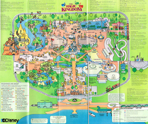
The entrances to Disneyland (and the Magic Kingdom) are famously designed like a movie - building anticipation until just the right moment when you round the corner and get the big reveal of the castle at the end of Main Street.  Everything is arranged for maximum emotional impact.  Now consider the entrance to Animal Kingdom.  Called "the Oasis," their equivalent of Main Street is a few winding paths through the woods - no shops, only a few light animal viewing locations.  Being named the Oasis, it might sound like it's all about creating a relaxed feeling in guests, but in execution, it's really not.  The music is not soothing.  There aren't a lot of places to sit.  It's the entrance to a theme park, so it's crowded, and it's outdoors in Florida, so it's going to be hot and muggy.  The design of winding paths isn't particularly relaxing in and of itself, but it's designed not to be relaxing but to appear undesigned, which is not the same thing.  Nature, of course, is an awesome and beautiful thing, which is why, if one wants to see nature, one goes to, say, a national park, where nature lives.  One does not go to a theme park, which is all about appreciating enveloping, immersive design.  Animal Kingdom is a theme park trying very hard not to be a theme park.  It's a theme park trying to be nothing.  It almost succeeds.

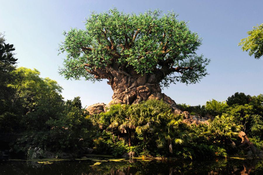
The Tree of Life

The Tree of Life

Instead of a beautiful, towering castle or a grandiose floating silver golf ball as a central icon, Animal Kingdom gives us a giant tree made of leaves that aren't quite the right color.  It's surrounded by a lot of real trees to give it an organic look and feel, meaning after you emerge from the Oasis into the center hub-like area, it takes you a second to realize you're even looking at the park icon.  If you know what's going on, you might appreciate the organic design on an intellectual level, but it's not going to make any particular emotional connection with you - and why should it?  It's not trying to.

Discovery Island, the central hub area, is confusing and maze-like, with isolated store buildings here and there but no logical layout.  This is true throughout the park, but while it does make it easy to get lost, the real crime is that it prevents ordered design from doing its thing.  In other parks, pathways are arranged to entice you to walk further in.  Walt liked to put tall attractions at the end of pathways, calling them "wienies" (cough) so that people would be attracted to the far reaches of the park.  Cinderella Castle, the Tower of Terror, Space Mountain, Big Thunder Mountain Railroad all function as wienies.  The circular layout of World Showcase around a lagoon means that virtually every country's pavilion functions as a wienie, too.  The lack of straight paths and the attempts to make everything look natural means there aren't a lot of well-designed sight lines, which means there aren't a lot of wienies in Animal Kingdom - only the massive Expedition Everest really qualifies.

Even the attractions themselves fail to make much of an emotional connection.  Everest is a nice roller coaster, and Dinosaur is a reasonably fun "dark ride," but they're both terrible at building anticipation.  Unlike Tower of Terror, which brilliantly builds suspense from the moment you see it at the end of Sunset Boulevard, Everest sits there like a very tall lump.  There are no touches designed to suggest danger.  No eerie music.  No darkness or lighting effects.  No dangerous-looking, crumbling architecture.  Nothing threatening at all.  What indications there are of the danger of the yeti inside are subtle.  You shouldn't have to read a paragraph in a museum exhibit to feel some suspense.  Until the moment your train goes through the initial temple on its ascent into the mountain you might as well be in line for the carousel, given the complete lack of emotional engagement you feel (unless you're scared of roller coasters, of course, in which case, you're already at DEFCON 1).

Dinosaur's entrance

Dinosaur's entrance

The same is true of Dinosaur.  The queue area gives you a museum exhibit narrated by Bill Nye the Science Guy.  The exterior is a fairly bland looking building.  It's supposed to be a thrill ride.  Who would know?

Or take the Harambe village area, probably the area with the most layers of detail and most areas to explore.  Compare Harambe to your average World Showcase national pavilion.  In Epcot, the countries are essentially reduced to picture postcards with restaurants - hardly an authentic representation of a modern nation.  Harambe, however, while it represents a fictional part of Africa, is alive with broken bricks and decaying newspapers plastered on old walls.  You can tell the instant you step in to Harambe that some Imagineer did a whole lot of research.  And it doesn't matter.  Not really.  

Harambe village

Harambe village

As inauthentic as a picture postcard is, a picture postcard is striking.  Maybe it's pretty, maybe it's charming, maybe it's exciting, maybe it's funny, but it's something.  It serves an emotional function and hence, requires design.  It captures an emotional height and makes an emotional connection.  I don't need authentic.  I don't need organic reality.  I experience organic reality every day!  That's not why anyone goes to a theme park.  I need something to be authentic enough to not spoil the illusion, and then I need it to deliver something awesome.  Something that makes an emotional connection.  It could be serenity like the Japan pavilion, mystery and atmosphere like the Mexico pavilion, charm like the Germany pavilion, or even (dare I say it) grand patriotism like the America pavilion.  What does Harambe make you feel?  It's just kind of there.  And yet it's so detailed!  So intricately crafted!  But to what end?  The whole area has no answer to the emotional "why?"!

(World Showcase actually almost fell prey to the same kind of thinking.  In the early planning phases, Disney was talking about having each country be represented by an identical, bland modern structure of some kind.  The thinking was that all countries would then appear equal.  This was rightly discarded as a horrifyingly stupid idea.  Sure, you might avoid giving a few extremely sensitive people offense, but you lose the personality, the flavor, the joy of seeing the traditional architecture of each country!  Fortunately, in Epcot at least, making an emotional connection won out over ancillary concerns.)

I love the safari ride.  I love Finding Nemo: the Musical (I would).  I love Flights of Wonder.  Animal Kingdom is not a bad park.  It's just not as awesome as it could be.  

If it tried, though, I bet it really could be...


Why I'm an Enormous Indie Game Buying Hypocrite

When I was a kid, as a diehard Super Nintendo fanboy, I thought myself flatly superior to the "Sega kids," both morally and objectively.  With them, it was always about "graphics."  That was always the most important thing.  Whatever games had the best "graphics," or at least pretended to have the best graphics, those were the games to play.  I sneered at them regularly.  Gameplay was obviously the most important thing, I thought.  Why waste time on pretty games that played horribly, when the Super Nintendo was right there with a fantastic library of games that were actually FUN, the equal of which has not yet been produced?  All those kids who cared about graphics were just the pawns of cynical advertisers, shelling out hard-earned cash for glittery garbage.  (Nintendo, on the other hand, was pure as the driven snow.)

This dynamic continued right on up 'til the present day with me.  Instead of SNES vs. Sega, however, it became about AAA vs "indie."  Right about the time of the GameCube, I started having trouble maintaining interest in console games.  A lot of games seemed to be trying to become ever more cinematic, which I had (and still have) no interest in.  Some games basically felt like elaborate movies interrupted by sequences of Simon Says ("Now push X!  Now push B!  Quick!").  Other games were gigantic, sprawling, complicated messes requiring never-ending tutorials.  Big, expensive games would come out that even had basic gameplay issues - poor camera control, bland storytelling, awkward mechanics.  The graphics were beautiful, of course, but the games weren't any fun for me to play.

So sure, buying indie games basically meant taking a huge risk on quality - but sometimes you could find an excellent title here and there, if you got lucky.  Somewhere, deep inside, I imagined myself virtuous and noble somehow, taking a chance on indie games.  After all, they couldn't afford good graphics so they HAD to rely on good gameplay.  Having cheap graphics is obviously no guarantee of good gameplay, but if the art isn't expensive, it makes it much easier to adjust, iterate, and fix problems with the rest of the game.  The lower the cost of developing art assets, the more likely the fundamentals of the game can be fixed.  Levels can be dropped and added, new mechanics can be introduced, and so on.  Hence, I figured I knew what was really important about a game.  It frustrated me to no end that the big game studios seemed exclusively focused on making games pretty rather than making them fun.

And then I had a rather unpleasant realization: I'm a gigantic game-buying hypocrite.

I realized this when I was reading a debate about indie games on a forum somewhere.  A bunch of gamers were arguing over what indie games "should" be priced, as though there was some objective, correct answer to that question.  The interesting thing to me was that there was actually a fairly large minority of gamers who felt like people ought to be willing to pay more for indie titles - the infamous "race to the bottom," they argued, was making it harder for small studios to survive in the current market.  Who can make a living in an environment where $0.99 feels like WAY too much for a game?  They argued that if gamers were willing to pay more for indie titles, we'd get better quality games.

The argument made a certain amount of sense, I guess, until I read a reply from a rather obnoxious forum member.  This guy was pretty upfront about his feelings on the subject.  He was perfectly happy to shell out $60 for a mediocre game from a AAA studio because he knew that they had whole teams of artists and programmers bringing the game to life.  He had no intention of ever paying that kind of money for an indie game that, no matter how fun or well-designed it was, could have been made by one guy in his basement.

WHAT?! was pretty much my initial thought.  Why should that make any difference at all to what you're willing to pay?  Isn't fun, isn't good design the WHOLE POINT of buying games?  Who cares what the developers had to spend to make it?  Was Waterworld a fantastic movie because it was expensive?

But then I realized - I behave exactly the same way when buying games.  He was simply articulating what I felt deep down - as irrational and goofy as it might seem.  I was in denial.  As it happens, I am perfectly willing to spend $60 on a AAA game that I play for a couple hours and abandon, or that even sits in its shrink wrap for all eternity.  On the other hand, for a game like Anagram Mathica, a word puzzle game for Android that I've wasted hours and hours and hours of my life trying to solve, I would not pay more than a buck or two.  Why?  Why am I happy to pay so much money for a mediocrity like Starcraft II but no money at all for a game that I love?

Because I could imagine myself building my own version of Anagram Mathica in a couple days, and I could never produce Starcraft II myself.  It doesn't matter that the game is lackluster and tepid compared to it's brilliant predecessor.  Just like that guy on the forums, I knew that Starcraft II required a huge team of artists and programmers to create, and I factored that into my buying decision.  The fun of the game was a distant consideration.  The graphics may not matter to my enjoyment of the game, but they absolutely matter to what I'm willing to pay for it.

So I realized I'm a hypocrite.  I may self-righteously champion the virtues of the low-resolution-but-brilliantly-fun game all day long, but I'm still not willing to pay for it.  And that's key.  Game companies can only be all about the fun until they run out of capital.  At some point, they have to make games people will pay for.  And if I'm not willing to pay for a good game with cheap graphics, then  I'm not going to get a good game with cheap graphics.  Studios are going to keep putting out the cinematic garbage that people will pay for.  And it will be my fault as much as anyone else's.

Is there a solution to this problem?

I suppose I could start donating to those few indie game studios that made games I love.  For all the hours of fun I had playing Anagram Mathica or Elliot Quest or Maldita Castilla I could pay extra.  Every little bit helps, right?  Or maybe some platforms could start selling "fair trade" indie games (in brown packages!), where you pay extra not only for the brilliant indie game but for the patina of righteousness you get from supporting a worthy cause.  Or maybe I can get super preachy on Twitter and convert people to the cause of paying more for a game than they feel should have to!  That's gotta work!  Right?

So is there a solution to this problem?

No.  There is not.

The Superlative Awesomeness of Ultima VII

I'm not the only person who thinks Ultima VII (1992) was a fantastic role-playing game.  I may be the only person who likes it for the reasons that I do, though, as (you may have noticed) I am very weird.  Maybe not, though.  Let's see what you think!

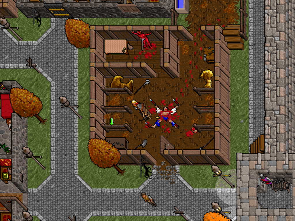
Ultima VII was famously the game where you could go buy sacks of grain from a farmer, put them into a mill and grind them into flour, which you could then take into a bakery and put on a table, add water from a bucket (that you filled from a well), and bake into bread, which you could then feed to your extremely whiny party members to get them to stop saying things like, "I could use some food" over and over.  It was also the game where you could watch as every single individual townsperson walked around town according to their daily schedule, working, eating at the tavern, maybe going to their "Fellowship" meeting, and going to bed.  You could sit at the tavern and watch all the townspeople gather and make chit-chat with each other.  At the time, and even to a large extent today, the game seemed absurdly detailed and lifelike.

You could do practically anything you wanted - go anywhere, kill anybody (although your party members might leave you in disgust).  When I first played the game, it took me a while to make the huge mental shift into its world.  The game starts outside of a stable housing a gory murder victim.  Naturally, this being a video game, I immediately walked into the stables and started stuffing absolutely everything into my backpack - horseshoes, brooms, hay, a bucket of blood from the murder scene - because, hey, it's not nailed down, is it?  It nearly caused my fifth-grade brain to melt out of my ears when I realized that none of this stuff existed for me - the horseshoe wasn't an item or an upgrade or the solution to a puzzle.  There was a horseshoe because I was in a stable and there are horseshoes in a stable.  I could pick it up and take it with me because... why not?  

Ultima VII was perhaps the first game I ever played where it seemed clear that the world did not exist merely to serve me as a game player.  The store owners did NOT keep their stores open 24 hours a day for my benefit.  If they were at dinner or asleep, I was out of luck.  If I invaded someone's house, they yelled at me.  If I broke all their jars and looted the (mostly useless) stuff inside of them, the jars did not respawn when I left the house and came back in - they were broken for the rest of the game.  It felt real in a strange way.  Goofy as it may sound, it's like there was a world I was visiting.  

images.jpg

Ultima VII gets a lot of credit for this, and rightly so.  However, lots of other games that followed have accomplished at least that much, and I haven't enjoyed them nearly as much.  But Ultima VII I still love.  Whereas Skyrim - a far more elaborate and advanced (and easier to play) game - is a pleasant diversion for a few hours, even now Ultima VII can draw me eagerly back to the computer to explore some more.  What's the difference?

I think the answer is that Ultima VII follows the "Pirates of the Caribbean Principle."  The game is all about extremes - the characters and stories are loud, colorful, and instantly accessible.  The amazing thing about Ultima VII is not just that there's a lot of detail, but that so much of the detail is actually interesting.  Any developer with enough budget and time can fill a world with "lore" and lifelike mechanics and details.  It takes a real storyteller, however, to make an entire world that's actually worth exploring.

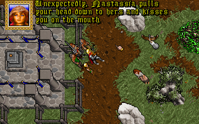
Virtually every townsperson in Ultima VII has a well-defined and colorful personality, including shopkeepers.  The barmaid in Trinsic is over-flirtatious, the barmaid in Jhelom is enormous and can beat you in arm wrestling, the barmaid in Skara Brae is unaware she's dead, etc.  They all have a brightly drawn, distinctive character portrait and a unique voice.  More significantly, they all have an opinion and frequently an agenda.  It may have to do with the main quest of the game (the mysterious quasi-religious organization known as "the Fellowship"), or maybe with the story going on in that particular town, but hardly anybody exists merely to sell you arrows or to fill out the population.  Ultima as a series was not necessarily known for being a story-driven game, but Ultima VII is a brilliant exercise in basic storytelling principles - keep conflict on the rise, use bold colors and strong characterizations, eliminate extraneous details.

That last one may come as a surprise, because to a lot of people Ultima VII is all about the extraneous details - the villager's daily schedules, the working blacksmith equipment, etc.  But I think if you'll look closely, you'll see that as "sprawling" as the game might appear, it's actually extremely TIGHT.  City populations are actually very small (And why is 95% of the population of Britannia single?  That can't last...), and the world itself is actually not that large size-wise.  Most of the towns are really quite close to each other (a fact that is obscured by the limited top-down viewpoint of the game).  Like Ocarina of Time, the world isn't big so much as full, which is to be preferred.  Each character in each town has a little role to play in either the larger quest or that town's mini-story.  And no, there aren't hundreds of unrelated miniquests to do.  Usually, each town has one main story and maybe a couple of tiny side stories to explore, but very few (if any) of these qualify as "side quests" in the traditional RPG sense.  No one asks you to "kill ten bears" or to go get a staff from a dungeon halfway around the world unless it's relevant to the main, single-threaded storyline.  What's more, there are secrets and treasures to find everywhere.  One of the great design principles of Miyamoto (designer of Mario, Zelda, and other Nintendo titles) is rewarding exploration, and Ultima VII follows suit.  The game's world might not really be "for me," in the same way that King's Quest or Final Fantasy was, but there was still a whole lot of treasure at the end of just about any given dungeon.  

I should probably note that when I say Ultima VII is a brilliant storytelling game, that I don't mean that there's a whole lot of plot or cutscenes in the game.  In fact, apart from the brief beginning and end, there are NO cutscenes.  Due to the nature of the game, you are constantly arriving to a town just after story has occurred - a grisly, ritualistic murder was committed, a wussy little man was challenged to a duel to the death by a warrior's guild, etc.  So even though you uncover clues to the story after the fact, there is still a story being told.  What's more, a story is being told in the very interactions and agendas of the characters you interact with.  "Plot" might be sparse in Ultima VII, but "story" is not.  (I should also mention how fantastically grateful I am that every book in Ultima VII contains only a blurb of text!)

What's frustrating to me is that I seldom hear game developers or game reviewers expound on these principles (screenwriters, musical theater writers, theme park attraction designers do though), even though they seem critically important to me.  It's possible I'm one of only a few who values them in application to the games world, although back in the 90's it seemed like they were just understood.  Given that the games that I do love are loved by many others, however, suggests that I'm not alone in valuing these things - or, at least, I hope I'm not.

Maybe one day we can have another Ultima VII.  Until then, I guess I'll just have to settle for the somewhat duller, emptier world of Skyrim. 

...

Nah, I'm gonna play Ultima VII again.


Golbez Teaches Storytelling

I remember this one part from Final Fantasy II ("Final Fantasy IV" for you video game purists out there), where the heroes are tasked with defending a castle from a continual onslaught of monsters from the villain's army.  At this point in the storyline, the heroes are supposed to be fighting a desperate, last-ditch battle in an attempt to save the castle in a hopeless, undermanned situation.  The trouble is, gameplay-wise, the bad guys are actually pretty easy.  Even as a 10-year-old I was able to dispatch them without too much difficulty.  But after each round of combat, the heroes would announce, "We can't hold this position any longer!  Fall back to the next room!"  And I'm just sitting there, ignorant ten-year-old that I am, going "I JUST BEAT THE BAD GUYS.  WE'RE HOLDING OUT JUST FINE."  Even though I won every individual battle, the sequence ends with Golbez, the generic-feeling Darth-Vader-like bad guy, sweeping in with his big purple cape and stealing the castle's magic crystal, as well as kidnapping the hero's girlfriend.  It was a bit of a frustrating feeling.  I won the battle, so why should I lose the story?

Well, now that I'm older, I appreciate the tricky balance that the game designers were trying to achieve with this.  The fact is, even though they didn't quite finesse the situation, they did achieve a significant victory.  I might have been a little frustrated and confused, but I was still very invested in the plotline, and I still felt like I had "won" that section of the plot somehow.  I had to see what happened next, but I still felt like I had made progress in the game.  That's a tricky balance that a number of more recent games have failed to achieve, believe it or not.

In order for the player to be invested in a game's story, the threat level has to feel like it's generally increasing.  It doesn't have to always increase (and probably shouldn't, as that gets exhausting), but the general arc needs to push the suspense meter higher as the game progresses.  This is a fairly basic storytelling principle.  You get your hero up a tree in Act I, throw rocks at him in Act II, etc.  The hero has to keep LOSING until finally, at the climax, the hero either finally wins ("quest") or is totally defeated ("tragedy").  The trouble is that in the context of a video game, the player needs to feel constantly rewarded - small-scale victories eventually leading to the grand, final victory when the game is won.  These concepts would seem to be mutually exclusive.  How can I write a story that keeps increasing the dramatic stakes while at the same time making the player feel like they're making steady progress?  How can the player both lose battles and win battles at the same time?

Final Fantasy II accomplished this by essentially divorcing the gameplay from the story at key moments.  Yes, your heroes win the individual battles they fight - but those battles are only a small part of the larger story, over which they have no control, and which is getting worse and worse for the heroes.  This occasionally results in feelings of frustration, but more frequently it keeps the player's interest alive.  Here are some more examples from Final Fantasy II:

  • Game Success: The player reaches the castle of Damcyan / Story Failure: The castle has already been destroyed by Golbez
  • Game Success: The player rescues Yang from monsters / Story Failure: The monsters have already killed the rest of Fabul's army
  • Game Success: The player slays the evil king of Baron / Story Failure: The king was just Golbez's puppet
  • Game Success: The player defeats the demonic dancing dolls / Story Failure: Golbez's severed hand takes the crystal anyway

In this way, the game (roughly) manages to make the player feel like the story's stakes are increasing AND that the player is somehow making progress and achieving goals.

Contrast this with the Legend of Zelda: Twilight Princess.  The introduction starts out pretty strongly - it turns out that the entire land of Hyrule has been overtaken by a mysterious dimension called "Twilight," turning the kingdom into a playground for freaky monsters and all the people into ghosts.  The trouble is that the villains are never stronger than they are at the beginning.  As Link clears each temple in succession, the Twilight gradually recedes from the land until it's restricted to a single pyramid around Hyrule Castle.  The story stakes actually go DOWN as Link makes progress in the game - the villain gets weaker and weaker until Link finally finishes the job in the last act.

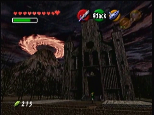
Granted, Zelda has never been much of a story-driven game, so it's somewhat forgivable.  But Ocarina of Time, a previous Zelda title, handled it better.  Do you remember how, halfway through the game, you're teleported 10 years into the future and Hyrule Castle Town is destroyed and swarming with moaning zombies?  How Hyrule Castle has been replaced with Ganon's volcanic palace?  That was an excellent, disturbing moment, and represented a more successful raising of stakes.  Young Link may have successfully found the three amulets in the past (gameplay achievement!), but now that he's in the future, it's a whole new ballgame (story stakes are raised!).

So it can be done.  Golbez proves it!


The Battletoads Postulate: The Joy of a Comic Book Universe

You ever played Battletoads for original NES?  I've played it many times, but I've never beaten it, and by "beaten it," I mean "gotten past level 3."  The game starts out smooth and easy, and then VERY SUDDENLY becomes difficult enough to quality as player abuse in violation of several United Nations statutes.  And yet, I keep going back to the game, over and over, to repeatedly ram my flying motorcycle into an oncoming wall.  Is it some sick gamer form of Stockholm Syndrome?  Yes.  There may, however, be something else involved - something potentially useful for modern game developers to note.  After all, I know I'm not the only one who played those first three levels of Battletoads over and over...

One of the things I remember most fondly about games from the 80's and 90's is how just about any game, even tiny little games, tried to build their own comic book universe around it.  When you started Battletoads, you were shown a "radical" logo and character introductions as though you were witnessing the next incarnation of the Ninja Turtles (or, at least, that's what the developers were clearly hoping you'd think).  Before even the first level, you were introduced to the Battletoads' anthropomorphic bird boss, the evil queen villain, and the Battletoads' spaceship in  short order, letting you know that not only was there a context and a story and a world for this game, but easily for an entire possible Saturday morning cartoon and/or breakfast cereal.  In a quick, efficient manner, the developers made it very clear that you weren't just playing a game, you were entering a franchise - I mean, another world.  That appeals to me.  Even the unfulfilled promise of that appeals to me.  

It wasn't just Battletoads, either, or games that relied on existing intellectual property.  Consider Mega Man X, Sonic the Hedgehog, F-Zero, Street Fighter II, Mortal Kombat, Killer Instinct, Banjo Kazooie, and on and on.  It wasn't just RPGs and adventure games that gave us comic book worlds to explore, but racing games, strategy games (Starcraft!), and every rip-off fighting game to plague the front nook of a Pizza Hut.  Even, to some extent, Mario.  They all came with an attached comic book universe.  (Why is this "Scorpion" guy fighting, and why won't his character description stay on the screen for more than 2 seconds?!)  It was as though the developers knew that it wasn't enough to simply give players an isolated game experience - they had to touch something else in the player, something a little deeper, so that they could go above and beyond, and with, a little luck, sell them toys.  

I consider this a tremendous positive.  For a kid to buy a toy based on a game, or whine at their parents until they bought the toy for them, that kid had to love the game.  A comic book universe was a longstanding strategy for accomplishing this - give the kids an alternative world to imagine themselves in, or to play with, or to argue about.  The keyword here, by the way, is "alternative."  The idea is for this other world to be somehow more awesome than the daily grind.  There has to be something about the alternative world to love.

A lot of modern games, in my admittedly limited experience, don't have comic book universes.  They have "lore."  I really hate lore.  I shouldn't, given how much I love exploring rich worlds created by other people, but every time I've played a game that had "lore," I wound up finding a bunch of literal tomes of information scattered around that I couldn't care less about.  Why are so many buildings in Dragon Age: Origins littered with books that read like script treatments from George Lucas - this and that empire fought this and that kingdom for such-and-such years, until such-and-such hero did blah-blah-blah?  (Even worse, there are games like Final Fantasy XIII that can not be understood unless you read them!)  This isn't creating an awesome alternative reality.  This is creating a boring pile of data.  Lore seems to have become synonymous with "details" or "information."  If you want to develop a history textbook for your world, fine.  I'd rather have a Saturday morning cartoon.  Or an action figure.  Or, to be more honest, the sort of world that lends itself to that kind of cynical toy manufacturing - because that world would need to be rich in strong character design, heightened reality, colorful places, and the promise of many more adventures to come.  

It can certainly be fun as a game designer to come up with a detailed geopolitical history of a place - it might even seem justifiable because it creates a pool of material to draw from later, especially if your name is Chris Metzen and World of Warcraft releases an expansion that goes back in time to actually give all those confusing old names and places you came up with some significance at long last.  I find, however, that the television writer's strategy for creating lore ("make it up on an episode-by-episode basis to serve the needs of the immediate story") tends to paradoxically work better in practice, as it focuses on the audience's emotional needs rather than the needs of the world itself (or of logic, which isn't as important as some claim).

A lot of indie platformers these days don't even try to create a comic book universe to live in - they focus on puzzle solving, or interesting physics models, or on ascending the challenge curve.  These games can be quite fun, certainly, but it's hard (for me at least) to fall in love with them, or even in moderate interest with them.  Some games do try, fortunately, but miss the mark a bit - I intend to review one I played recently in more detail later.

With my own platformer, The Adventures of Chris, I often worried that I hadn't really given full justice to the comic book universe I wanted to create for it.  I relied a lot on fourth-wall breaking humor, which I enjoy, but which also can up the "silliness" quotient too far, and break the illusion that a comic book world needs to sustain itself (yeah, I know, a comic book world can actually be TOO silly).  So, for this reason, I'm playing around with revamping the script a bit as I revamp the graphics and music - ramping the silliness down somewhat (but not all the way), adding more emotional heft to Chris's journey, and fleshing out the world of villains and magic he finds himself swept up in just a little bit more.  After all, I want to invest you a little more in an alternative world.  I want you to have something to latch on to, something to help you believe that there's more to this world than just the glimpse the game provides.  I want to give you something as awesome, if possible, as the first two-and-a-half levels of Battletoads.

I want to sell you toys.

Why I Still Have a Weird Love for the 7th Guest

You ever play an old game called The 7th Guest?  It was a haunted-house-themed "CD-ROM game" back when "CD-ROM" was a shiny, brand-spanking-new concept.  It was a multimedia game, even.  (Until then, games had only been able to employ one media.)  It was truly the dawn of a new era -- an era of Microsoft Encarta articles about tapirs whenever you wanted.

A lot of people remember the game a little... less than fondly.  This may or may not be because, in some respects, the game was terrible.  And yet, I love the game.  I still love it even after all these years.  It has a weird grip on me that I've been trying to explain.  I'm certain a fair chunk of it is nostalgia, but I strongly suspect that there's something more there.  And I think modern games could actually benefit from studying it ... in certain respects.

I am perfectly willing to grant you that the game was flawed - the acting in the full-motion video left  everything to be desired, the puzzles were often brutally frustrating, and the storyline was random and confusing, if it could even be called a storyline at all.  What's more, the puzzles - arguably the central "game" of The 7th Guest, were all isolated experiences seemingly divorced from any larger story or purpose.  This seemed to annoy a lot of people.

Some folks will defend The 7th Guest in spite of these things - they'll say it had an excellent, excellent soundtrack by The Fat Man (which is true), and that the house itself was creepy and well-designed (which is true).  However, I would like to take a different tack and defend it on the basis of some of the very reasons that so many people disdain it.  Hear me out on this.

Since The 7th Guest, I've tried a number of horror-themed puzzle games (mostly on mobile and web platforms, where this sort of genre seems to thrive) and they all bore me to tears.  They all have a suitably dark, creepy haunted house to explore, with lots of old artifacts to pick up and play with, and generally lots of old letters and books to read, with the idea that by reading a bunch of dimly-lit text, you will uncover the mystery behind the moderately scary house you're trapped in for whatever reason.  These games typically have a more reasonable, even believable, storyline, and all the puzzles are nicely integrated into the environment and story.  I've seen one game go through a lot of trouble to justify why the builder of the house saw fit to require three different statue pieces to unlock a door, etc etc.

The thing that annoys me is that, (for me at least) that kind of thing profoundly doesn't matter.  I don't need my storylines to make a lick of real sense.  I need them to make emotional sense, to carry me along on a wave of feelings - I don't need anything "explained."   I don't want to read any text to explain the storyline.  That's boring.  Heck, that's almost as boring as zombies.

The 7th Guest, by contrast, was especially threatening to me as a kid precisely because it made no sense.  The lack of sense, whether intentional or not, created a real sense of mystery.  The storyline was presented in chunks in no particular order, some of which seemed to contradict the events in other chunks.  As a kid, I was certain I was missing something, and that vague, oblique style of storytelling worked very well - mostly by preventing me from ever feeling like I really knew what was going on.  Knowledge is power, after all, and in a horror game you really want your user to feel powerless.  Explanations, logic, reasonableness, internal consistency - all these things are the enemy of suspense, mystery, horror, and emotional manipulation.  Don't play by the player's mental rules - threaten them at every turn!  Especially when you're making a horror game.

The 7th Guest was an excellent mood game as well.  Virtually the entire game is presented as one continual tracking shot - a deliberate design decision that means the reality of the game is never broken.  Camera cuts are comforting because they remind you there's an editor between you and the thing you're watching - it's a distancing device.  Remove all cuts, and there you are - just you, all alone, in this empty house.  

The lack of ability to directly control your POV helped as well - you could give direction with the animated, beckoning skeletal hand, but once you clicked, the house seemed to kind of take you wherever it wanted you to go, at whatever random speed it wanted, through whatever object it wanted.  You didn't even know who or what you were supposed to be yourself.  The environment was threatening in a surreal, quiet kind of way - dark, cavernous reaches of rooms you were unable to explore, strange color palettes, that big, strange, sweeping staircase in the foyer, etc.   You were never really afraid something was going to jump out at you, but you were never allowed to feel settled.  You were at the game's mercy in a way that inventory-collecting, weapon-firing games can simply never achieve by their very nature.

The randomness of the game helped create the feeling that you were in a world where magic and ghosts reigned - there were no rules that you had any power over.  Hands could reach at you through a painting, dishes could fly around for no reason, a doll could suffocate a baby that you're not sure whether it ever was a real baby or not...  You could travel down a drain or through a telescope - whatever the game wanted.  No reasons, no explanations.

The music was also very well done (it's one of my favorite game soundtracks), but sometimes the most effective thing about the music was its bizarre absence for long stretches, or its continuation past when it "should" have ended.  The voice of Stauf, the evil toymaker whose spirit rules the house, is always very clearly in control.  The puzzles might seem isolated and random, but as a kid, I never had any doubt that they were all part of some sick game being played on me.  His voice, more than anything else, helped blur the line between reality and fantasy for me as a kid.  He always knew where I was, watching me play.  There was no indication that his power was in any way limited or defeatable, making him an excellent villain.  It made the game awesomely unsettling without the use of jump scares, gore, or depressing elements. 

I imagine that if you've played this game for the first time as an adult rather than a kid, it wouldn't affect you the way it affected me.  In fact, you'll probably react the way many of my friends reacted when I showed it to them as adults - you'll get really frustrated at the puzzles and laugh at the cheesy ghost acting.  And there are probably more effectively unsettling non-jump-scare/non-gore horror games out in the modern era that I haven't played (if you have a recommendation let me know!).  But in spite of it all, I still have a soft spot for The 7th Guest.  And I probably always will.

Replacing Maelstrom with a Frozen Ride?

I felt a strange, sinking feeling when I heard it.  Evidently, Disney plans to replace the Maelstrom ride in Epcot's Norway pavilion with a Frozen attraction.  It wasn't just a rumor.  I don't know why, but, as a huge Disney theme park fan, the thought really bothered me somehow.

It's not necessarily because I was in love with the Maelstrom attraction to begin with - it does have a nostalgic charm for me, but it's a very short ride and looks its age.  The problem is with the intended replacement.

As far as Frozen goes, I enjoyed the film, although I don't think it holds a candle to the Ashman/Menken masterpieces of my childhood - you know, Aladdin, Beauty and the Beast, The Little Mermaid.  Speaking of which, have you ridden the new Little Mermaid dark ride in the Magic Kingdom?  That's what I'm worried about Maelstrom getting changed into.  The Little Mermaid ride is the very definition of theme park mediocrity.

It's technically called "Ariel's Undersea Adventure" but it might as well have been called "Ariel's Disconnected Undersea Static Musical Sequences."  I remember stepping off that attraction and not being able to figure out what I was supposed to enjoy about it.  I don't say that (merely) to be snarky - it was a legitimate question in my mind.  There are plenty of rides I don't enjoy that I at least feel like I knew what the designer was going for.  (For example, I'm supposed to be thrilled by spinning around really fast but mostly I get nauseated, etc.)  But for the Little Mermaid attraction, I just felt like I was getting shown various dioramas of scenes presented squarely from the movie, as though I was just supposed to say, "Ah, remember that scene from the movie?  Wasn't that great?" or maybe "LOOK!  IT'S ARIEL!"  The only exception was a brief sequence where the sinister eels are beckoning you into Ursula's lair - I actually liked the darkness and slightly threatening feel there.  But otherwise, it was a surprisingly dull ride.

Other Disney dark ride attractions have more of an emotional connection to create - Snow White's Scary Adventures was supposed to be scary, Mr. Toad's Wild Ride was supposed to be zany and threatening, Peter Pan's Flight was supposed to be dreamlike and magical.  Little Mermaid was supposed to be... what?  An authentic 3D replica of isolated moments from the movie?  It's one thing for an attraction to fail at its emotional goal, its quite another not to have one at all!

The Imagineers may surprise me when they renovate Maelstrom, but I highly doubt it.  If they keep the layout of the existing boat ride, they won't have a lot to work with.  Maelstrom is short.  Disney promises us we will be "immersed" in the music from Frozen, but how's that exactly?  Will we hear two seconds of Elsa singing "Let It Go" while our boat rushes past the place where the polar bears used to be?  Of course, I could be underestimating them - maybe they'll figure out a way to make the ride a magical experience somehow.  Maybe they'll figure out a way to lengthen the ride.  Maybe they'll figure out a way to engage people in a way that isn't just "here's a few characters and songs from the movie."  Maybe the attraction will actually be well-written.  

I have to say, though, it appears that Disney is relying increasingly on the demand of five-year-olds to see a particular character as the central rationale behind their new attractions.  Five-year-olds can certainly motivate their parents to ride through Little Mermaid, or The Seas with Nemo and Friends, or endless character meet-and-greets, but it's not the sort of thing that inspires whole families to actually want to come back.  It's possibly lucrative but ultimately destructive.

So I've gotta plead with Disney - please make the new Frozen attraction something with a cross-generational, lasting appeal.  Something that could even appeal to a person who's never seen the movie.  Something that will still be awesome more than five years from now.

Please?

The Pirates of the Caribbean Principle

There have been several times where someone pitched an idea for a story or musical to me that went something like this:

"So this guy is an artist, right?  And he's generally a nice guy but he has a little bit of a fear of commitment.  And he's trying to figure out whether to be true to his art or maybe live in this commercial space.  What do you think?"

If I had been totally honest, I would have said something like, "Why, that sounds like the most excruciatingly boring concept for a story I've heard in quite some time!"  I probably didn't say that, because I am so conflict-averse, but I was thinking it.  But why?  Why is that particular idea so boring and awful, and why are such ideas so depressingly common?

Is it that the ideas are trite?  I'm not so sure that explains it - "trite" ideas can be "classic" if you like them enough.  

My money's on something else - notice the number of qualifying words in that pitch: "generally," "little bit," "maybe."  Even the "but."  It's wishy-washy, middling.  Maybe the writer is trying to write what he or she knows, or express a personal experience, but it's never clear why anybody else is supposed to care.  It lacks extremeness.  Don't tell me a story about something ordinary.  Tell me a story about something on the edge.

I call this the Pirates of the Caribbeans Principle, after the classic Disney ride.  (I'm quite sure I didn't think of this, but I can't remember who I stole it from, so I'll just take the credit for the time being.)  A theme park attraction is under constraints that a novel or play or even short story isn't - a vignette has to make an emotional impact in the 10 seconds that a boat is gliding by, with no guaranteed beginning or end.  The pirate has to repeatedly dunk the town mayor in the well so that whether the boat sees him going down or coming up, it makes just as much sense and is just as emotionally effective.  Unless you want to require riders to go through over and over again, it has to be comprehensible, clear, and impactful almost instantly.  This is quite the design challenge, but I feel like it would make other art worlds vastly better to try to adhere to the same constraints - including the musical theater and game design worlds.

In fact, musical theater and game design both have been under such constraints in the past.  Early games didn't have a lot of resources to store pictures and text, and musicals had to get the story told in the short moment that the curtain was down, before the next 20-minute dance number came on.  But as technology and traditions changed, they've been freed up from the need to make their point and get out, mostly to their detriment.

So without actual constraints, designers in these media will have to self-impose.  One of the ways to do this is by encouraging extremeness.

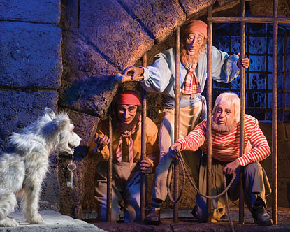
If you actually got out of the boat and stood next to one of the Audio-Animatronic pirates, he would seem mighty grotesque - look at that face.  It's a ludicrous cartoon character rendered in three dimensions.  But from the vantage point of the boat gliding by, that pirate's face communicates everything that needs to be communicated quickly and powerfully.  

The point, by the way, is not that exaggeration precludes subtlety and mystery - in fact, it can help both.  Subtlety in the absence of intensity just feels like nothing.  Nor does exaggeration automatically guarantee value - what's being exaggerated matters, too.  Exaggeration carries a risk.  Exaggerate something dumb and you get something VERY dumb.  But if everything is middling and wishy-washy, you've got no point of interest, no emotional impact.  So you might as well take that risk.  Failure to take that risk is often disguised as sophistication or realism when it's actually creative cowardice.

Musical theater songwriter Stephen Sondheim likes to quote the "less is more" principle, and he's right to do so - but your choice of what "less" to use matters, or else the "less" really is less!  Consider the famous auction scene from Pirates.  You know the redhead lady is enjoying strutting her stuff, and the gag lands with only a line or two of dialog.  In fact, it lands even if you can't hear any of the dialog, because the visuals are so exaggerated and so clear.  Your eye immediately jumps to the lady in red, standing in the center, and then off to the lady in blue behind her and the pirate auctioneer.  As you realize the absurdity of what's going on, the humor response kicks in.  The colors. lighting and staging draw your eyes instantly to what matters.  What's important is exaggerated and spotlit, and what's not is pushed into the dark background of the nighttime Caribbean village.

In fact, clarity is the other important part of the Pirates of the Caribbean Principle, along with extremeness.  They mutually reinforce each other - things that are interesting receive more focus, things that are boring are sent to the shadows - creating breathing space, and allowing the interesting things to be accentuated by virtue of contrast.

It might be instructive to consider an attraction that has extremeness but severely lacks clarity - the thoroughly mediocre Universal attraction called "Revenge of the Mummy."  The ride system is reasonably entertaining, the special effects are mostly all right, but the whole thing is paced so rapidly that it's never really clear what's going on, and the whole experience feels like a muddy mess. (Harry Potter and the Forbidden Journey has similar issues.)

Or consider a lot of modern games, like Donkey Kong Country Returns for the Wii, where so much junk is happening on the screen at once - highly polished, good-looking junk certainly - that it's hard to focus on what's important.  In game design, the concept of putting things in the background that should be in the background is even more important than other media, because busy visuals confuse gameplay and makes concentration a chore.  That giant blimp going by in the background might look cool, but it has nothing to do with the actual game, so it effectively functions as a banner ad on a Geocities page, drawing the player's attention in multiple directions when it needs to be focused and clear (and also irritating the crap out of the player).

This is why the dark areas in between the vignettes of the Pirates ride are just as important as the vignettes themselves.  They create pacing, provide contrast, establish atmosphere and tone, and allow you to focus on what's important.  Without the breathing spaces, the exaggeration becomes perverse and overwhelming.

So if you're going to tell me a story, make it about something on the edge - a real hero, a threatening villain, a dire situation, a beautiful world.  Like Tolkein's Middle Earth, make something more than reality typically affords.  And then once you know what's important, clear out the cruft.  Communicate what matters and then get off the stage.  Then you too can be as awesome as a ride about pirates.


Why Indie Game Devs are Like Preachers (Sometimes)

A while ago there was an interesting debate on a gaming forum I read - somebody had donated to a Kickstarter for an indie game and felt burned when the recipient spent some of the money on stuff for themselves.  Game devs responded with peculiar intensity - they have to live same as anyone else, don't they?  They argued that if that money supports them full time so they can develop the game, then it shouldn't matter WHAT it's paying for.  The emotions were running high, shall we say.

What was most interesting to me about this debate is that I felt like I like had it before, but in a completely different context - a church budget meeting.  Some members at the church I was going to at the time were upset that they were paying so much money to one of the staff when we were having trouble making budget.  Every line item on the church budget was heavily scrutinized to make sure it was legitimate, and if it was deemed otherwise, a surprising amount of anger was unleashed.  Why such an intense reaction to this stuff, I wondered.  Why so emotional?  

Certainly, we don't care "where the money goes" when we buy a pizza or a couch.  The pizza delivery guy can spend it on whatever the heck he wants - we got our pizza.  But for churches, non-profits, and (evidently) Kickstarted projects, suddenly the money we give comes with a lot of strings attached.  Why should that be?  When we donate to a church or a non-profit, you might think that it would increase our sense of goodwill and charitable-ness, but then you would be dumb.  Instead, the fact that we "donated" the money has all sorts of implications.

It might seem like people perceive donations differently than people perceive purchases.  I would argue, however, that people perceive them in exactly the same way.  This may or may not be a bad thing, depending on the situation, but it seems clear enough to me that it happens.  

People don't give money without expecting something in return.  When we purchase something, we get the thing we bought, and the transaction is complete.  When we donate toward something, we might think we are selflessly giving towards a good cause, but in fact, we are purchasing something - perhaps the good feeling of having supported a cause, perhaps goodwill from others, perhaps progress towards some moral end - but it's seldom 100% altruistic.  Otherwise, why would we be so upset when a non-profit doesn't deliver 99% of our donation directly into the hands of starving children?  Or when a preacher takes his family to Disney World?  Or when a game developer uses Kickstarter funds for general life purposes?  Our donation actually was a purchase of something - and certain things can make us feel like we've been cheated out of what we purchased.  "I didn't put that check in the collection plate so you could live the high life," and so forth.  

Now, for the record, this may or may not be a bad thing.  This instinct may help us keep churches and charities and Kickstarter recipients honest, but it can go too far, I think.  We seldom understand all the economics at play.  If I demand that my preacher live on a pittance, he may decide to go somewhere else where he and his family don't have to live like paupers.  And so on.  Our desire to not feel "cheated" out of our "donation" can be destructive in some ways.  Maybe that non-profit is able to do so much good precisely because it pays the best and brightest a living wage to do its work (or maybe it's a racket - but you can't assume either way!).

The fact that we feel the same way about donations to completely non-moral/non-charitable entities like game developers is interesting to me, because it shows that this instinct really isn't theological in character - it's not that we have some special ideas about preachers per se.  We have some special ideas about our money when we donate it, no matter who we donate to!  It's all about economics and services rendered (or not). 

So if you accept donations for any reason whatsoever, just don't be surprised when people act like it's not your money to do with as you please.  And if you donate, be aware of what you feel you're really purchasing, and whether or not that feeling is fair to the organization you're donating to.

The Importance of Maps

I love maps.  I've loved them since I was a little kid.  I loved the maps that you got at the entrance to Disney World.  I loved colorful maps of far-away countries.  I loved the maps of Narnia and Middle Earth and Wonderland and Neverland and other fantastic places in the front covers of books.  And I loved the big fold-out maps that came with video games - Zelda, Final Fantasy, Dragon Warrior, Ultima (cloth maps!) - showing elaborately detailed and exciting locations, all neatly organized in geographic space for my personal convenience.

I still enjoy maps - so much that the world map is a central theme of my OUYA game.  I really had no choice in the matter.

And now I've started to think that maps may be very important to games in general, even (possibly) to people who aren't as strangely map-obsessed as I am.  A map means something.  Yeah, sure, it's a handy reference tool for a game.  Yeah, sure, it means that the game creator is significantly invested enough in the world to flesh it out and treat it with respect.  Yeah, sure, it can be a fun collector's item to stick in the Deluxe Edition box to sell to suckers like me.  But a map in a video game means something much cooler than any of that, and to show you why, let me give you one of the most effective "maps that aren't maps" from classic games...

This isn't a "map" per se, but it accomplishes the same thing to me - that thing that made game maps (and theme park maps!) so awesome to me as a kid:

Maps let you know that more awesome is on the way!

Each empty space in that inventory box is a signal that there's something fantastic and fun you've yet to discover - something that's going to give you a new ability when you press that B button!  A new tool maybe, a new weapon.  A location on a map is something to explore or discover, a spot in an inventory is something to collect or something to give you new power.  Either way, it's something that makes you want to keep playing!

It's actually a pretty simple principle.  I can't tell you how many times* I've taken a chance on a new video game - AAA or indie - and after playing for five minutes, or an hour, or even several hours, I get the decided impression I've seen all the game has to offer.  At that moment, I start to believe that I can pretty much extrapolate from what I've already played through to the end, and whether I've enjoyed it so far or not doesn't matter - the mere fact that I feel like I can predict the rest of the game means I instantly lose interest.  

One of my friends told me she has a tendency to play through Zeldas right up to the last dungeon, at which point, her motivation dies.  Why shouldn't it?  Mine does too!  There's no more surprises at this point.  No more worlds to explore or new awesome abilities to acquire or characters to meet.  Probably no more new songs to listen to.  Just more fights and puzzles, and probably more annoyingly difficult ones.  More challenge, but less payoff.  The anticipation of future awesome is gone the minute you realize it's time to set foot into Ganon's Castle.

Now the sad thing is that this principle applies even when my intuition is WRONG.  Maybe there really are awesome surprises on the way - new places to explore and new content to discover.  The thing is, I've been burned so many times with games since I was kid, I feel like it's the game developer's responsibility to LET ME KNOW THAT MORE STUFF IS COMING!  

What's a good way to do that, you ask?

How about... a map?

How about an empty inventory screen?  How about an exciting, swirling front page demo showing glimpses of all the excitement to come?  How about creating a story with actual suspense (very hard to do, by the way)?  Even Super Mario Bros, which had no map at all, managed to maintain interest by introducing new content almost instantly.  Sure, World 1-1 is a typical flat green landscape, but World 1-2 is a strange underground destructible environment, World 1-3 is a platform challenge in the treetops, and World 1-4 is a castle full of fiery traps.  You don't have to beat 4 (or more) levels of green flatness before the game rewards you with new content.  It slaps you in the face with new content right off the bat so you expect that even more new content is nigh.  And you know what?  It delivers.  There are water levels, flying-fish bridges, mushroom forests, Lakitu, and more wackiness still to come!  The level of variety and interest created in a simple, 8-bit platformer is astonishing to me.  (Miyamoto was a friggin' genius)

No literal map needed, but this is all you need sometimes:

I can kind of guess why maps (literal and not) are becoming depressingly less common.  New content is expensive.  It's time consuming.  When making The Adventures of Chris, the most difficult and time-consuming parts were composing the music and drawing the art assets.  Every level that was a "new concept" meant more testing and more risk, and I tried to get a new play concept in almost every level.  I definitely could feel the temptation to repeat myself, hoping that new arrangements of existing material and increasing challenge levels will be enough to sustain interest.  For some people, it might very well be.  As for me, I start to feel like every game becomes reducible to Tetris - the same thing over and over, harder and faster.  And yeah, Tetris can be fun.  But games can be so much more for me.

They can have maps.

*47

Beating the Post Release Blues

Vanity, vanity!

Vanity, vanity!

Last year I had my very first (and so far only) musical produced in Boston.  This year I released my very first (and so far only) console game.  What do both experiences have in common?  If you said, "They both left you mysteriously and deeply sad after they were over!" I say, "Congratulations!  You are a very smart person or maybe you read the title of this blog post!"

I've learned a tremendous amount through both experiences, but probably the most surprising thing was the weird funk I felt at the end of them.  I don't say surprising as a euphemism - it hits you with the speed and ferocity of a sumo wrestler on a bowl of chanko nabe.  Even if you think you see it coming, you are not prepared.  (However, I was rather quite prepared for Burning Crusade.)

So, naturally, when you feel sad to such a sudden and intense degree, you start to wonder "WHY?"  The obvious candidate would seem to be the sudden lack of stimulation and immediate purpose.  If you've ever done theater, you know how intense it can be.  This is true even if you are the writer of the show and your only official job after rehearsals start is "occupy space in theater while stuff happens around you."  A vast majority of my free time was spent focusing on the show.  When it's all over, it can certainly feel like a gigantic crash. 

I mean, that makes sense, right?  That could explain the blues!  Except that, during the whole experience, I kept thinking, "MAN it will be so NICE to finally have some time to RELAX!"  The end of the show certainly provides plenty of time to relax!  Why not revel in it?  Why feel sad and not relieved?  There have certainly been times where I worked really hard for many weeks on something and was glad to be done with it - travel and demos and conferences for my day job, just to name several hundred examples (by my last count).  

So for this reason, I feel like it's not simply the sudden lack of stimulation or purpose that leaves one feeling sad.  It's something else.  I trace it to one particular moment.  I felt it during rehearsals while I was in my day job office.  I call it my "Ecclesiastes" moment.

If you're not familiar with the Hebrew Bible/Old Testament, Ecclesiastes is perhaps the most depressing book in the whole Bible - King Solomon basically lists all the pleasures available on the planet and explains why, in the end, they're all "vanity, vanity."  (I like really like the book for some possibly perverse reason.)

Well, at that moment, in my office, it's like I suddenly realized that the whole musical was "vanity, vanity."

I sometimes feel like there are two Chrises in my head - we'll call them Dumb Chris and Smart Chris, because I say so, and that's how our relationship works.  When I work on a creative project, Smart Chris is very conservative about things.  He said, "This is just a fringe theater company in Boston.  It's a very nice first step into the theater world, but the odds of it launching your writing career just aren't that high.  It will probably be a whole lot more work to get your SECOND production."  Dumb Chris, however, said, "Oh my gosh!  YOU'RE GETTING PRODUCED!  There is now a NON-ZERO CHANCE that Cameron Mackintosh or Hal Prince will walk into this theater, love your show, and give you a contract for a MILLION JILLION DOLLARS!  A NON-ZERO CHANCE is practically a CERTAINTY!"  Dumb Chris is dumb.

The trouble is that, for some reason, Dumb Chris has all the emotional controls in my brain.  If you had asked me, I would have told you I KNEW everything Smart Chris said to be true.  But I BELIEVED everything Dumb Chris was telling me.  And that random moment in my office was when Smart Chris had finally had enough, shoved Dumb Chris out of the way, and grabbed the controls.  "Actually, Chris," he said, "the odds are fairly high that few people are going to even notice your musical at all."

"Vanity, vanity."

I'm not a big of Smart Chris.  He makes me feel sad.  

And I think THAT'S the real reason I got hit so hard with the blues after the musical was done.  A little part of me - that dumb part that believed that somehow I had taken the first step towards "making it" - died.  The show was over, and it would be right back to before.  I had a cast album and a video, but my life would be pretty much the same.  The set was gone, the magic was over, the theater would have somebody else's dream in it.

So when it came time for my next project, a video game - a light-hearted, classic-style adventure platformer for the OUYA - I thought, "My heart and soul WON'T be in this project!  My expectations will be ZERO!  Smart Chris will have the controls from the get-go!"

Who was I kidding?

For the record, my expectations were zero at first.  But when I released the game on OUYA, I had no idea the game would immediately show up on people's screens in the "New Releases" section.  I was expecting a trickle of attention at the most, and suddenly there was... SOME.  "Some" was more than I had been expecting.  And there were some positive reactions from some people!  Some people were marking it 4 or 5 stars on the OUYA store!  This was all it took for Dumb Chris to get right back in the controls.  Clearly, this was the first step to becoming the next Shigeru Miyamoto.

So naturally, once the game moved off the front page of the OUYA store, things went back to normal, and the Ecclesiastes moment kicked in again.  

So is there a way to beat this, other than actually be wildly successful?  I don't know.  I sometimes read interviews with people who I feel like have made it, and they still seem to get hit by Ecclesiastes moments.  Quad-jillionaire actors in Hollywood wonder if their career is over.  Big time writers worry that their moment has faded.  Maybe even success can't beat it - it just delays it.

Maybe the answer is to force Smart Chris into the controls from day one and be more aggressive about keeping him there.  Don't let my expectations get away from me.  Don't fantasize about things that aren't likely to happen. 

The trouble with this strategy is, if I REALLY had logical expectations for my creative projects, I wouldn't bother with them.  The odds are too against me.  Real success would require me dedicating my whole life to my creative pursuits, instead of a few nights and weekends for fun, and EVEN THEN it would be a lot of work with no guarantees whatsoever.  

But I don't want to do that.  I don't want to stop making things.  Even in spite of the post-release blues, I HAD FUN.  I enjoyed getting that email from F.U.D.G.E. Theatre Company saying they were going to be producing my show, even though it was slightly, you know, not written at the time.  I enjoyed rewriting Act Two at the last minute, and seeing the theater process in action, and meeting great people.  I enjoyed making my game, and watching friends play test it, and clicking that "Submit" button on the OUYA website, and yes, I enjoyed believing somewhere in that stupid brain of mine that this was only the beginning.  I had fun being dumb.  Sometimes, I still do.

So you know what?  I think the "answer" is just to take the punches of reality and keep going.  The post-release blues don't last forever.  I encourage you not to label them "depression" and not to hide yourself away from the world because there's no reason to prolong the feelings.  Start thinking about the next awesome thing you're going to make.  Hal Prince, famed Broadway director/producer, always made sure to have another project lined up to work on the day after the last play opened.  Seems like a good strategy.  Take the downs with the ups.  Just keep moving on.  Enjoy the dreaming.

I mean, after all, who knows?

Bottom 10 Video Game Character Designs

So I was thinking the other day about all the truly horrific character designs I've seen in video games throughout my life, and naturally, I thought I should share some of them with you, on the theory that you will somehow enjoy this.  

(I should say before I begin that, yes, I realize this may be a horribly negative way to start off a blog, but I think you'll find that, in the end, I don't care.  But it IS important to remember that there are many games I haven't played, and so I might be missing some character designs that are truly epic in their awfulness.  In summary, this is all simply one guy's opinion, and if yours differs, that's what makes it wrong.)

So with that, let's start the countdown!

#10: Freya (Final Fantasy IX)

"Gee..." you might be thinking.  "That's quite the, uh... triangular costume you got there..."  You would be exactly right to think so.

Freya is a disappointment to me.  If you said, "Hey, Chris, let's have a female dragoon named after a Norse goddess," I would have said, "Hey, that sounds like an excellent idea!"  If you then said, "And let's make her an anthropomorphic rat," I would have said, "Hmm... I'm not so sure about that..."  If you followed that up with, "And she should wear a misproportioned triangular pink suit with bellbottom sleeves, and we'll make all her facial features REALLY TINY so you're never quite sure what you're looking at," I would have punched you in the face.  

And don't get me started on Amarant and Quina...

#9: Sindel (Mortal Kombat 3)

Sindel was the point for me where Mortal Kombat went from dancing on the edge of camp to wallowing in it.  To me at least, she looks like they threw some costume elements together from the Halloween aisle of CVS.  The banshee screams, the living hair, the flying move that pretty much just makes you more vulnerable... the whole package is too cheesy, even for Mortal Kombat.  (Although I should state for the record that I love cheese.)


#8: Cecil (Final Fantasy IV Remake)

You know, someone who's job title is "Dark Knight" should have, as an objective matter, legs at least somewhat wider than a drinking straw.   

#7: Female Dwarfs (World of Warcraft)

The trouble with these characters is that clearly the designers were trying to make them somewhat conventionally attractive.  This is a fool's errand.  Male dwarves aren't conventionally attractive - they're comical.  They're characters.  For best results, the female versions should have likewise been comical characters, instead of the freakish-looking mutants we were given.  Maybe something like Helga from Clay Fighter...

#6: Piantas (Super Mario Sunshine)

I realize these guys are supposed to be cute, stylized, friendly-looking characters that you want to rescue from the evil paint-thing in Super Mario Sunshine, but I just can't get over how ugly they are.  I don't want to save them.  I want to jump on them repeatedly.

#5: The Gremlins (Epic Mickey)

People were really annoyed by Navi, the little fairy that followed Link around in Ocarina of Time shouting "Listen!" and giving helpful advice over and over again.  So I guess it seemed to the folks who designed Epic Mickey that the right thing would be to still give you a relentlessly annoying helper, but make it a tiny, floating old man with a strange bulbous head, permanent cross-eyes, and goofy proportions instead of a fairy.  There!  All better now!

#4: Mrs. Pac Man

Am I supposed to getting "sexy" from this?  Because it's not really working... (hat tip to the awesome Meghan Plott for catching this one!)  Although it seems to be working for that ghost there... he seems to be really digging those yellow, spherical ladies.  Gee, that puts a whole new spin on the whole "being chased by ghosts" aspect of the game...

#3: Baby Mario (Yoshi's Island)

I know it's supposed to be Mario, and the whole point of the game is supposed to be saving this baby, but this kid's head must be at least 40% nose by weight.  (And his body is 75% head by weight, so do the math...)  Big noses are cute on some characters, but please Nintendo, THERE IS A LIMIT.  That single tooth, the endless crying, the wacky proportions... I wouldn't have blamed any of those Yoshis had they "accidentally" left this kid floating away in a bubble once or twice...

#2: Tingle (Majora's Mask)

What on earth were they thinking with this guy?  The little goatee... the shiny, skin-tight green outfit... the red, bulbous nose (as though he's just finished doing... something)... the tiny, tiny legs... even the name "Tingle"...  WHY?!?!?!?  And I'm supposed to find him adorable somehow, instead of truly, deeply horrifying?

#1: The Great Fairy (Ocarina of Time)

THE HIDEOUS CACKLE... THE FLAILING LIMBS... THE UNCANNY VALLEY... THE POINTY, POINTY... EVERYTHING!  PLEASE, MISTRESS FAIRY, DON'T POKE MY EYES OUT WITH YOUR LOVING EMBRACE!  I PROMISE TO BE GOOD!  So scared... so scared...

So did I forget anything obvious?  Any other truly regrettable character designs out there that I missed?  Let me know!

Just How Open Should a World Be Exactly?

At a recent E3 event, Nintendo announced that their upcoming Zelda game would be "vast," feature a "wide world," be "open," as well as "vast," and, on the whole, be "vast."  This prompted some cynical commentary from some folks who played Twilight Princess (a previous title in the Zelda series): "How can a vast, open world be fun when the last time you tried a larger, free-moving kind of world, it wound up being kind of empty and desolate and boring?"  Well, this is a matter of opinion, of course, but the answer is, "It can't."

I'm a little surprised to hear myself say this, because ever since I was a kid I liked to say that I preferred non-linear, exploratory, free-flowing games, for example, the early Zeldas, Ultima VII, various and sundry RPGs both American and Japanese.  It turns out I didn't know what I was talking about.  There were plenty of completely linear, restricted games that I loved then (and love now).  Final Fantasy II (US), for instance, a game I adored, featured a remarkable number of ridiculous excuses to keep you from going a direction the narrative didn't want you to go ("Sorry, the old man won't let you pass the bridge until you've talked to your love interest in the last town!  After that, he has no issue with it"), but I didn't mind a bit.

And this leads to a generally important point when it comes to art-type endeavors - people generally don't have the slightest idea why they like anything, or how to articulate or describe their preferences and opinions.  We simply react, and for the most part, everything else is a total mystery.  In a musical theater critique group that I'm a part of, I was taught a lesson that stuck with me mightily, in the form of a quote from... somebody.  Let's say Mark Twain.  "When it comes to emotional reactions, the critic is always right.  When it comes to suggestions for how to fix your work, the critic is always wrong."  This may be a slight exaggeration, of course, but it isn't.  People tend to know what they like and don't like, but not why.  For this reason, you can get into a lot of trouble by listening to your audience for anything other than, "How did you feel?"

It's times like listening to this E3 announcement that make me worry that Nintendo is making the mistake of listening to people's stated preferences.  They say they want a vast, open, free world, but then, when they get one (Twilight Princess), it's not terribly satisfying.  Sure, the vistas are pretty and, I suppose, "vast."  But vistas alone do not a 30-hour game make.

So what is it that people (and by people, I mean mostly me) actually want when they say they want large, open worlds?  Well, if you look back at some of the extremely awesome earlier Zelda titles, like Link to the Past (SNES) and Ocarina of Time (N64), you'll realize that the worlds weren't actually very large.  The games employed tricks to make them seem large and "world-y", but in reality, entire towns can not support themselves on an economy consisting exclusively of midway games (at some point, agriculture HAS to enter the equation).  The worlds weren't big, or even "vast."  They weren't even necessarily as free and open as they could have been.  But they did allow some freedom, which is important, and most significantly, they were FULL of interesting things to see and do.

When people say they like "exploration," I believe they don't really want "freedom," what they want is "content to explore" - and that's a big difference.  They also don't want to be frustrated by artificial constraints if they can be helped.  This doesn't mean that perfect freedom is called for.  It just means that they need enough freedom to not get annoyed that they have to go somewhere or do something.  But more significantly, if the thing they have to do is interesting enough, they won't mind having to do it.  (For example, when I first played Final Fantasy VII, I was deeply annoyed at the linearity of the multi-hour opening sequence in the squalid modern city of Midgar.  Now that I've matured somewhat, I enjoy that part of the game most of all - it has an awesome atmosphere and a compelling story.  As a kid, I kept waiting for the "real game" to start.  Now I know - Midgar WAS the real game!)

It's tricky.  It's not that people want perfect freedom.  They want enough freedom to feel that their choices have rewarding consequences.  We want to think, "What's behind that tree?", go look, and find something cool.  If we don't find something cool, the ability to look behind the tree is no longer that important.  The rewards can take many forms - it could be an actual treasure, like a Piece of Heart, or 20 rupees (but it should be a Piece of Heart :P).  It could be an exciting new place to look at, with new music to listen to, new characters to talk to, and new designs to admire.  It could be something else that I'm too dumb to have dreamed up.  But it needs to be something.

Nintendo has been very good at filling worlds with treasures to hunt for and find.  Every nook and cranny of earlier Zelda titles had something squirreled away in it - perhaps a Moblin forking over money for no reason, telling you "It's a secret to everybody!"

So Nintendo, please, if you do a "vast" world, try to fill it with as many cool things to find as possible.  Make the world free if you have to, but make it interesting and rewarding first and foremost.  You've done it plenty of times before!